Getting Started with ObservePoint Charting
 May 28, 2026
 45 mins


Summary
Raw data tables tell you what’s happening — charts tell you what to do about it. This session from the ObservePoint Customer Success team is designed to help customers turn their ObservePoint data into clear, actionable visualizations that drive real decisions. Nic Suder and Logan Bell walk through:
- Five charting fundamentals every user should know
- Real-world scenarios — broken links, cookie compliance, tag vendor analysis — built live in the platform
- How to share charts with stakeholders, schedule reports, and reduce alert fatigue
- Product updates including the new support portal, global search bar, and consent category enhancements
If you’ve been looking at the same data tables and wondering how to communicate what you’re seeing to leadership, developers, or your privacy team, this session will show you exactly how to get there.
Key Takeaways
-
Start simple.The most effective charts are often the simplest — before you click "Add Chart," ask yourself what question you're trying to answer, because the question determines the report, and the report determines the chart.
-
Focus on one question at a time.If you find yourself explaining what each bar, line, and color means separately, you've built a puzzle, not a chart — split it into multiple single-purpose charts and your audience will actually act on them.
-
Use charts to surface trends quickly.Charts let you spot spikes, regressions, and patterns in seconds that would take minutes to find in raw data — making them the fastest path from "something changed" to "here's what changed and when."
-
Turn reporting into operational visibility.Charts aren't just for looking at data — they're for sharing it with the right people at the right time, whether that's a privacy team, a developer, or leadership, so that everyone can see what's improving, what needs attention, and how much progress has been made.
Speakers


Webinar Transcript
Welcome, everyone — thanks for joining us today. This is the kickoff of a new webinar series called ObservePoint Tips, hosted by the Customer Success team. Month over month, you'll start seeing familiar faces leading these sessions as we walk through different areas of the platform and share practical ways customers are using ObservePoint day in and day out. Your CSMs are on the call as attendees and available in the chat to answer questions as they come up — and if anything we cover today prompts follow-up questions or a deeper dive, reach out to your CSM directly or bring it up on your next call.
Before we dive in, quick introductions: I'm Nic Suder, I manage our customer success team here at ObservePoint. Joining me today is Logan Bell, one of our CSMs and our resident charting guru. The focus of today's session is charting — between the two of us we spend a lot of time helping teams turn ObservePoint data into clear, useful visualizations. Here's the agenda: a few product updates, why charting matters operationally, charting fundamentals and best practices from Logan, real-world examples with a live demo, and practical ways teams are using charts today.
A few product updates to kick things off. First, we've released a support portal directly within the platform. There's also been a UI update — the left-hand navigation bar has been refreshed and some settings have moved to the top right. To find the support portal, click the cog in the top right and select Support Portal. From there you can track support requests, journey requests, and tag requests all in one place.
Second, we've introduced a global search bar. Hit Command-K on Mac to search at any time, or use the bar at the top of every page. You can search across any audit or journey, find labels you've created, consent categories — everything is in there. A pro tip: the search bar keeps a history of recently selected reports, which makes jumping between two audits or comparing reports much faster.
Finally, we've made a number of quality-of-life improvements to consent categories. ObservePoint can now import consent category configurations directly from your CMP, bulk operations are much easier, additional consent category data has been pulled into reporting, and we now accept regex statements for assigning cookies to categories — a big time saver for mass applies and removes. If you're not yet using ObservePoint for privacy validation, bring it up with your CSM.
Why use charting? When data sets get large, it becomes hard to quickly identify what actually matters, what trends are forming, and where your team should focus first. I love this analogy: a large report can feel like a cockpit. There's a huge amount of information — gauges, indicators, warning lights — all technically valuable, but completely overwhelming if it's your first time seeing it. A trained pilot knows exactly what each instrument means. Charting is how you turn that cockpit into something a non-pilot can act on. Instead of scanning through thousands of rows, charts surface patterns visually — spikes, regressions, trends over time — instantly. The goal isn't visualization for its own sake. It's making operational reporting easier to understand, easier to communicate, and easier to monitor over time.
We could spend hours on charting theory, but I'm going to boil it down to five principles. Follow these and you'll be ahead of almost everyone in your organization who doesn't know them.
Principle 1: Pick the chart that matches the question. The chart type isn't a stylistic choice — it's the answer to the question you're asking. Trends over time call for a line or area chart. Comparing categories calls for a bar or column chart. Data broken into parts might call for a stacked bar. Pie charts can be a trap: if you have more than three or four categories, a bar chart is almost always clearer.
Principle 2: Use insightful titles. This is one of the most skipped steps. "Cookie report" or "broken links" tells the viewer nothing. "Broken links over time — excluding 403 and 429 errors" tells them exactly what they're looking at and what's been excluded. A good title means the viewer doesn't have to spend time deciphering the chart before they can use it. An AI-assisted naming layer is on our roadmap to help with consistency here.
Principle 3: Use the axis honestly. For bar and column charts, the value axis must start at zero — that's how viewers visually compare the length of bars. Starting at a non-zero value can make a 1% difference look like 50%. For line charts you have more flexibility, but be deliberate. The same data plotted starting at zero versus starting at 1,450 can look like a flat line or a dramatic spike — and that difference matters when you're communicating to leadership.
Principle 4: Use color with intention. Color on a chart should mean something: it encodes a category, or it highlights a specific data point you want the viewer to notice. Rainbow palettes look fun but just distract. If you establish green as "approved" in one chart, keep it consistent across all your charts — your viewer shouldn't have to relearn the visual language every time.
Principle 5: One chart, one message. If you find yourself explaining "this bar shows this, this line shows this, this color encodes a third thing" — that's not a chart, that's a puzzle. Split it into two charts. Simplicity is the priority. Your viewer's brain will thank you, and each chart will land harder.
To summarize the anti-patterns: don't combine multiple data types unless necessary, avoid clashing colors, don't complicate for its own sake, and don't mislead the viewer with manipulated axes. If a chart tells you nothing useful, it's better to make three simple ones than one complex one.
Before you click "Add Chart," ask yourself: what question am I trying to answer? Not what chart do I want to make — what question am I trying to answer. The question determines the report, and the report determines the chart. If the chart is too complex, most viewers will close the tab. Keep it focused.
Scenario 1: Proving that a broken links cleanup worked. The question is: did broken links actually go down, and when? The broken links pre-built report is the right starting point. Filter to the last 12 months, group by date — weekly or monthly buckets work well here — and you'll get a clean line showing the trend. Grouping by time is your vehicle of measurement: even days with no broken links should register, so the baseline is clear.
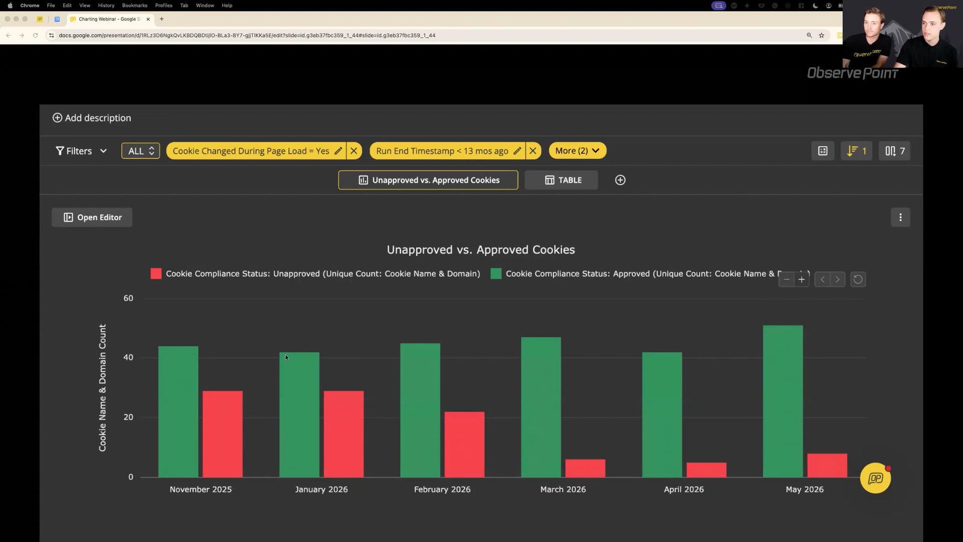
Scenario 2: Showing that cookie compliance is improving month over month. The question is: how many cookies are approved versus unapproved, and is that share getting better? Use the cookie inventory report, group by month, and a stacked or side-by-side column chart works well — green for approved, red for unapproved. My recommendation is to keep the two series as separate bars rather than trying to layer in a third metric like total cookie count. Answering two separate questions on one chart usually backfires.
Scenario 3: Visualizing which tag vendors are most common across your site. This is what we'll build live. The tag report is our base. Group by tag vendor, and we want a bar chart sorted by page count so the most prevalent vendors are at the top.
(Live demo)
One quick callout before the live demo: when you log into the platform, your landing page is the reports gallery. Many of the pre-built reports in this gallery already have charts attached. It's worth browsing through — there's a good chance the chart you want is already there. Cookie compliance over time is a great example: it comes pre-populated with several ready-to-use charts.
For the live demo: open the tag report as a base, group by tag vendor, then click Add Chart. Name it something descriptive — "Tag Vendor by Page Count" is much better than "New Chart." Select the grouped bar chart type, set the category column to tag vendor, and the value to page URL count. Sort the table from highest to lowest so the chart reflects that order. Then format: add a legend, add data labels if helpful, and adjust colors if you want them to align with your organization's conventions.
To share the report, save it first, then use the Share and Export menu to generate a public link. Anyone without platform access can view the report through that link, and you can disable it at any time — useful if you're sharing with a vendor for a limited period.
One feature worth highlighting: when scheduling a report to send on a recurring basis, there's a checkbox that says "don't send this email if the report is empty." This is a powerful way to reduce alert fatigue. If you've set up a weekly report for unapproved cookies and your team resolves all of them before Monday, you simply won't receive an email. You only hear from ObservePoint when there's actually something to act on.
The full workflow is: configure the table, group by what you care about, add the chart, format it, save it, and share it. Put yourself in the shoes of someone who isn't as technical as you, and ask whether they'd understand it at a glance.
We've talked about why charting matters, how to build effective charts, and how to create visualizations inside the platform. Now let's make it operational. The goal isn't to create charts that look good — it's to help teams detect issues faster, investigate what's changed, monitor trends over time, and continuously improve their environment.
Here's what that looks like in practice. When a chart surfaces a spike — broken links, unapproved cookies, accessibility findings, a shift in performance metrics — the exact issue is less important than the fact that the chart caught it immediately. That's step one: detect. Step two is investigate: use the filtering and customization in reporting to zoom in on the specific issue. Step three is communicate: share the chart with the right team — privacy, analytics, development, accessibility, leadership. A clear visual makes it much easier for people who weren't in the weeds to understand what happened, how significant it is, and what needs their attention. And don't underestimate this as an opportunity to show the progress you're making. Charts that show unapproved cookies trending down, or broken links decreasing after a cleanup, are powerful ways to demonstrate the value of the work you're doing. Step four is monitor: once remediation is underway, keep tracking the trend to confirm things are actually improving and staying resolved after releases.
A few key takeaways to close: effective charting is about clarity, not complexity. Start simple — the most useful charts are often the simplest. Focus on one question at a time. Use charts to surface trends that raw data would bury. And think of charting as a way to create operational visibility across your whole organization.
Homework: create one chart this week. It doesn't have to be complex — just apply what we covered today. And if anything from this session sparks ideas for your own environment, bring it to your CSM on your next call. Thanks, everyone.


