ObservePoint Tips: Making the Most of ObservePoint Reporting
 July 30, 2026
 57 mins




Summary
Most teams have far more reporting power in ObservePoint than they actually use, logging in to look for problems instead of letting the problems surface themselves. In this session, ObservePoint Technical Success Managers John Davis and Eve Alexander walk through how to turn raw audit and journey data into reports that answer the questions your stakeholders actually care about, covering:
- Recent reporting upgrades, including the redesigned Report Gallery, bulk report management, and new calculated columns
- Building a report from scratch with columns, filters, grouping, and breakouts
- Practical use cases like spotting CSP-blocked tags, wasted MarTech spend, duplicate tags, broken links, cross-border data transfers, and tag performance
- Sharing and scheduling reports so the right signal reaches the right person, fast
Whether you’re just starting with reports or already have a library saved, the recording shows you how to move your reporting one step further — from manually checking for problems to having the right issues automatically surface to the right people.
Key Takeaways
-
Most of the reporting value you're missing is already in your account.Reporting now lets you build across all your audit and journey data in any format — time series, aggregated lists, charts, granular detail — from an estate of hundreds of domains down to a single page, tag, or network request.
-
Most of the time, the report you need already exists.The redesigned Report Gallery ships around 100 templates for the most common use cases, filterable by type, use case, framework, and popularity; when nothing fits exactly, start from the closest template, adjust the columns, and save.
-
Start from the question, then build the report to answer it.A good workflow is to strip the columns back to the essentials, then add what you need — using filters to stay specific, grouping to roll rows into a pivot-table summary, and breakouts to compare before-and-after or pass-versus-fail side by side.
-
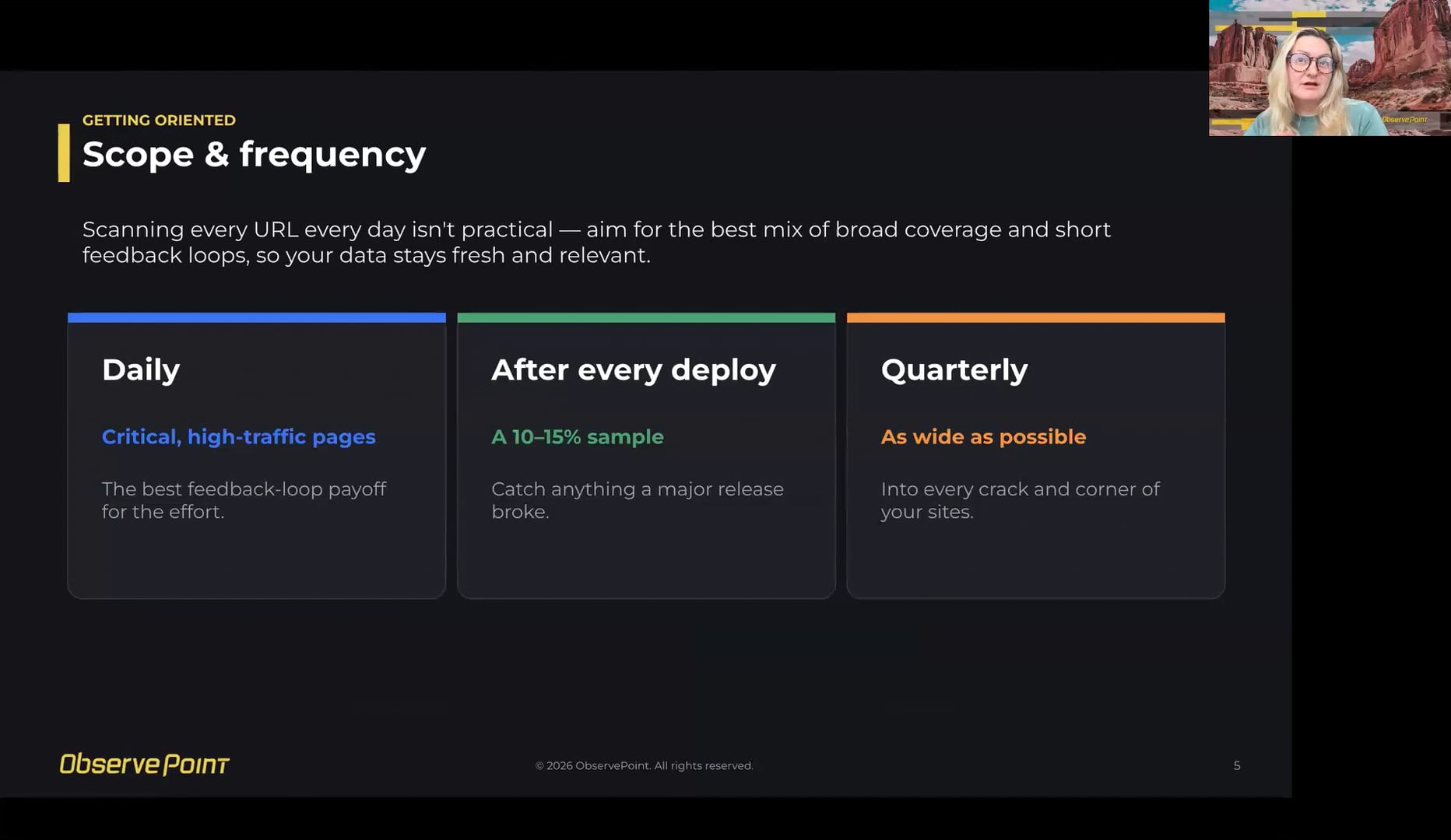
Fresh reports depend on the right audit cadence.ObservePoint's web governance framework recommends a daily audit on critical, high-traffic pages, a 10–15% sample after deploys to catch what a release might have broken, and a quarterly wide crawl into every corner of your sites — the best mix of broad coverage and short feedback loops.
-
Match what you share to who receives it, and schedule it.Individuals can keep a private library and share public links, teams organize with labels, and leadership gets scheduled reports on key trends; scheduling a burndown-style report with "only send when there's data" turns it into an alert aimed at a specific owner with a specific ask.
Speakers


Webinar Transcript
Welcome, everyone — thanks for taking the time today. We're excited to talk about our reporting product. My name is John, I'm a Technical Success Manager here at ObservePoint. We're planning on about 45 minutes to chat about reports and demo some cool stuff, then about 15 minutes for questions afterward. So drop your questions in the chat whenever they come up, and we'll hit them in the moment if it makes sense, or save them for the end. We're both CSMs — we do this with customers every day — and today is all about helping you get the most out of the reporting product you already have in ObservePoint.
Exactly. I'm Eve — hello to everyone I recognize, and nice to meet everyone else. Today we're going to cover the basics of building reports, the different report types, a few newer features, and a load of practical use cases for surfacing the data that matters most to your teams. Whether you're a complete beginner or you've been using reports for some time, hopefully there's something for you today.
Here's the plan. We'll cover a few things we've shipped recently and some product updates, then talk about why reporting matters, a quick word about getting your data ready, and then — at the heart of it — a set of quick live demos on real sites showing how to build a report from scratch, plus some recommended use cases. Then we'll close with how to share what you find, and a few best practices.
Before we get into strategy, let us quickly show you five recent upgrades that should make all of this easier. The first is the Report Gallery tab — we'll talk more about it later, but the gallery's a great starting point for key use cases. What's new is that it's now a fully dedicated page, rather than a collapsible section hidden away at the top. It's easy to spot, with clear report descriptions. You can group by use case, framework, or report type, and there are "new" and "popular" badges to point out things you might not have seen, or that other customers have been enjoying. You can also see if charts are available — just "charts" and a number — so you know if there's a pre-built chart template. And you can filter and browse templates before saving them into your account. Then in the Saved Reports tab, you can search, filter, and group your reports by label, type, creator, or any of these fields.
What we recommend is adding labels to your reports for better organization — just use the little plus sign. A lot of templates come with auto labels anyway, but you can add your own too, and the same report can have multiple labels. You may also have noticed a blue banner at the top — that's an AI auto-label option to help you get started. It's a one-time thing to lower the friction, and then you can organize from there. In the meantime, let me show you how to bulk-manage reports: hover over them, select a few at once, and use the bottom tab to manage visibility — who can see it, just you or everyone — bulk-favorite, bulk-add labels, or bulk-delete. And your last filters are saved automatically, so bear that in mind. I'll stop sharing, John, so you can do the last few updates.
Thanks, Eve. I can show the next three features from a single report. I'll use the Create Report option — these are all the available data models you can build reports from. I'll use the pages report, because there are a couple of new columns we recently added to this data model. I'm going to add two: All Page Links and All Page Cookies. This is a pages report, so every row is a single page we scanned in an audit, and I want to focus on successful pages — I don't care about broken pages in this use case — so I'll filter down to successful status code types.
These two new columns are calculated fields. All Page Links is a comma-separated list of every link we found on that page — the link text and the URL — regardless of whether we actually followed and scanned those links. All Page Cookies is a comma-separated list of the cookie name and the base domain of that cookie. This lets you do some really useful logic. Say someone in your legal counsel asks, "Is our privacy policy link available on all our production sites?" That might have been a complicated project in the past, but now it's easy: I'll set a filter on All Page Links to show all pages that do not contain the privacy policy link — assuming your link text is just "privacy policy" — apply it, and you get a list of every URL missing that link.
All Page Cookies works similarly. You could say, show me all the pages that don't contain the _ga cookie — a popular Google Analytics cookie — and quickly get that list. A couple more quick features: the undo and redo buttons, probably a godsend for a lot of folks. You can undo changes back to your initial state without reloading the page. And to finish, not a new column but a recent bug fix on the page source type column. That column tells you how we found a page: it's either a starting URL in the audit settings, a link we crawled to, or a page we found in the sitemap. We recently fixed a bug — affecting all audits that ran after April 21st this year — so we now accurately show which pages came from a sitemap. So that's what's new. Now, why does any of this matter?
Here's the big shift. Reporting now lets you build across all of your data in whatever format you need — a time series, an aggregated list, a chart, a detailed list of data points — as granular or as high-level as you want. It used to be that audits and journeys gave you a fixed set of reports we'd designed, but now you're in control. You can report across an estate of hundreds of domains, or drill all the way down to a single page, a tag, or a network request.
The real value is the feedback loop. When a report is scheduled, when leadership owns a metric off of it, or when detailed errors get sent to the right folks, you stop going to look for problems and the problems start to surface themselves. Automating that loop is where the value really is. So, quick check — where are you on this ladder? Crawling is logging in to take a look; walking is having a few saved reports you check every so often; running is scheduling and setting up alerting; and flying is leadership owning some of the metrics found in these reports. Wherever you are, everything today is about moving up one step.
Most of you should already have audits running, which is great — this is more of a quick reminder on scope and frequency. It would be great to scan every URL every day, but realistically that's not practical. The goal is the best mix of broad coverage and short feedback loops, so the data you're looking at always stays fresh and relevant.
For audit coverage, our general recommendation is: first, a daily audit on your critical, high-traffic pages — that's the best feedback-loop payoff for the effort. Then a 10–15% sample after deploys, to catch anything a major release might have broken. And quarterly, go as wide as possible into every crack and corner of your sites. That's not something Eve and I just made up — it's our official recommendation from the web governance frameworks ObservePoint recently released. So if you look at your test coverage and spot gaps, that's a great thing to raise with your CSM. Alright, here's the fun part — we're going to go live and walk through some real use cases we've seen with organizations we've worked with. I'll stop sharing, Eve.
I'll kick this part off. In my main demo I'll show you how to build a report from scratch, then a couple of other use cases I made earlier. Let's build one from scratch. Picture a scenario: my company's migrating to a new website or CMP, or going through some large change project, and I want to know exactly what's happening with my tags before and after the change. I'd like a snapshot before and after to show whether there's been a change in tags and completeness — say, the number of pages containing each tag and any different tag accounts. For some of these I'd want it to stay the same, and for others I'd hope it was different, depending on the situation.
To start, let's create a tag report. I'll click Create Report — you can choose from a variety of report types: accessibility, audit, browser logs, and so on — and I'll click the tag one. When you build from scratch, this view is a starting point you can make bigger or smaller. Personally I like to start with the columns as simple as possible and build back up with the information I want. The main focus is my tags, so I'll start with just that column — you can drag columns around, so I'll move it all the way to the left, and there's a handy three-dots option to remove all columns to the right. I also want the tag account, so I'll add that: I start typing "tag account," and if you open the arrows you'll see there are so many metrics you can add, depending on which bits of info you care about most.
For this example, looking at before and after a big change, you can either compare different runs, or copy an existing audit and make a post-change version — that's what I'll show. I want to compare the most recent run of two different audits, one before the change and one after. So I'll add a column for audit name — type "name," which is the column I want. I also want to add a filter for just the audits we're looking at today, because otherwise you're viewing data from your whole account. This view shows every audit you've got, so use filters to be really specific about what you want to see.
With filtering I've got a couple of options. I can click the three dots on the column I'm filtering and do it there — I know the names of the ones I made, my normal one and a post-migration version, so I'll apply that. The other option is the Filters button at the top, where you can filter by any metric whether or not it's a column in your report. So now we're just looking at my pre- and post-migration audits. Next, I want to show you how to group.
Grouping in ObservePoint turns raw, row-by-row data into aggregated statistics — really a pivot table. Raw data is one row per page or tag or whatever the report scans; if you group by a column, that data collapses into one row per unique value, with every KPI rolled up into a summary stat for that value. As an example, raw data might show hundreds of rows, one per page a tag fires on — but if you group by tag, you get one row per tag with a count of the other columns. We actually want to group by tag and tag account, so I'll do both: one row per tag/tag-account pair, with the metrics rolled up for each pair. That's useful when an account has multiple tag accounts on the same page and you want the breakdown per pairing rather than one blended number.
The underlying logic is: whatever you group by becomes the row identity, and everything else becomes a metric summarized against it. So the two decisions that matter are what to group by — what you want one row for each of — and which metrics to keep — what you want summarized. The information we want here is the number of pages containing each tag and any different tag accounts, so we'll use breakouts to show before and after the change.
I want to compare one order against another, so let's add a breakout for pre- and post-migration. I'll click the three dots and choose Add Breakout by Value. I know my audit names, so I'll filter by name — and you can actually add multiple breakouts at once rather than individually, so I'll select my normal one and my post-migration one and add them. I can move the columns around into the order I want. Let's also change the page aggregation to the metric I'm looking at — the final page URL — so I get a nice view of the pages each tag and tag account are on and can compare differences before and after. I'll click the three dots, choose Change Breakout Aggregation, change the column to Final Page URL, and apply it — same on the other one.
This is an example report, but you can scroll down and see that post-migration, this tag now exists where it wasn't there before. If that's what you wanted, you've confirmed it worked — fantastic. Otherwise you may have flagged a problem: if the numbers went down and tags were removed, you can ask whether that was actually meant to happen. It basically alerts you to expected or unexpected changes; it depends on what you were hoping to see.
I also want to point out drilling, which I really like. If I wanted to see the list of the 25 URLs in a specific audit that a tag is firing on, I click the three dots and choose Drill into this group in a new tab, and it shows the list of URLs. If I go ahead and save this report — I'll just call it "test" for now — I then get sharing options. If I wanted a public link, I could click Share Public Link. One thing to point out: people I share it with can also do that drill-down. They only have access to the data they're looking at, but they do have access to whatever raw data is powering the report. John will talk about sharing later, but I wanted to flag that with drilling. So that's building a report from scratch.
We've also got a few other examples prepared, but before that — you can take inspiration from our gallery, which has around 100 report templates: ready-made reports for the most common use cases. It may look a little overwhelming, but as I showed you can filter down to the most common and popular ones. A few good ones: knowing where your broken links are, checking your cookie inventory, responding to a data subject access request, pulling a tag inventory. Most of the time, the report you need already exists — but it's tailorable. On the rare occasion it isn't there, pick one that's close enough, edit the columns like I showed when building from scratch, and click save.
I've got a few use cases I made earlier, and for some I used these templates to start and just made small adjustments. The first is checking confidence in CSP. This is a browser log report that tells you whether your content security policy is silently blocking legitimate marketing and analytics tags from firing. CSP is a security control IT puts in place to block browser-to-third-party traffic — it's built for security reasons, but MarTech and analytics tools are by definition third parties. A misconfigured CSP can block them by accident, meaning you keep paying for tags you're not getting data from. This can hit marketing or analytics tags — Facebook, and so on. In this example you can see all these tags being blocked by the CSP, filtered to log level equals error. Each one is a tag you're paying for but getting zero data back from.
In terms of how I made this, it was literally the template — I went to the reports, removed the filter, typed in "CSP," and it was Tags Triggering CSP Error. Highly recommend it.
Next, a few good ones high on your list should be about ineffective spend on web technologies. There are a few reports you can use to make sure you're not wasting money on the technologies running on your site. Between them they cover three ways spend gets wasted: paying for different tools that do the same thing, paying for tags that fire twice, and paying for tags that are broken and never fire at all. Let's start with a tag inventory report grouped by tag category — this tells you which technologies are running on the site, grouped by category, so you can see the overlap between tools doing the same job.
Multiple tools doing the same job cost money two ways: license and maintenance. In this example you can actually see three different analytics platforms, plus multiple tag management stacks running in parallel on the same pages. So you're paying for and maintaining three analytics platforms to answer the same question — one of them is Universal Analytics, which was sunset in 2023, so it hasn't collected a single data point since then. If it's firing on page views for zero data, it's still costing engineering the upkeep. Point that out and you might save on a few things. Similar story on tag management — multiple instances usually mean a migration that was never finished, or two teams building independently without shared visibility, which wastes money and ties up resource on maintenance and configuration.
How I built this: again, the tag inventory template — I grouped by tag category and removed a couple of columns. Another reminder: filter by the audits or folders you're interested in, so you're being really specific in your focus.
Another one — analytics duplicates. This tells you which tags are firing more than once across the site. A duplicate tag sends a duplicate request: that's double the cost if it's usage-based, and it inflates your data by double-counting a visitor. That combination of paying twice and having the wrong numbers makes it one of the best findings to bring to someone's attention. Analytics tags are usually the highest cost-impact, but it's worth checking other tags too — just remove the "tag category = web analytics" filter to see duplicates across any tag. In this report, if we look at Adobe Analytics, you've got 144 duplicated request URLs.
That's 144 tracking calls that fired more than once when they shouldn't have. The max identical request count is 15 — so in the worst single case, one tracking call went out 15 times in a row for the same page visit, all with identical content. And there are 68 distinct pages affected, so it's not one broken page — it's happening across 68 pages. Put together: on 68 pages, Adobe Analytics is sending the same event over and over per visit, up to 15 times in the worst case instead of once, across 144 separate instances. Anything measured by that event is overcounted by roughly that multiple.
Again, really easy — it was the analytics duplicates template. To see it for tags other than analytics, just remove that tag category filter. The last one before I hand over to John is a rules report.
This one is rule results in the last 90 days — it shows which tags are misconfigured or missing against the rules you've set up to check them. Why does it matter? You're paying money for technologies to give you valuable data, and if they're missing or not working as expected, you're getting no data or untrustworthy data — a waste of time and spend. If the pixel never fires, nothing's collected for the money spent; the same applies to corrupted or wrong data. This report monitors whether tags you've paid for are working how you need them to. In this example you can see rules flagged as failing — where they passed, and where they failed for tags missing or incorrect variables.
I made this using the breakouts feature I showed earlier — I added a breakout by value to see how many times a given rule passed versus failed, split into whether the tag's missing or it's the incorrect variables. If I wanted to drill down after a breakout, I could see which pages failed a given rule with the same three-dots drill-down. How I built it: I used the broken rules report, took off the filter that they were broken so I could see the passed ones too, and added a column for the then-condition tag result. That's back over to you, John.
Awesome, thanks, Eve. I'm going to walk you through three more use cases — a very popular one, one that's interesting to me, and a very nerdy one. I'm doing this in a way where I load report templates so you can follow along and open the same ones. For the sake of time I'll go quickly. Each use case has a question behind it. The first: where are all my broken links, and where can I find them? We have a report template for broken links specifically, so we'll start there — a really popular one.
I'll add one more column in a sec, but if you haven't seen this report, there are two main parts: the source final page URL and the link URL. The source final page is which page the broken link exists on; the link URL is the broken link itself. You get status codes for both, plus columns for link text and link outer HTML to help you find these links on the pages. I'll add another column — source page source type — similar to the one from my last demo. This is for the source page the broken link exists on, because you might have a list of the pages these links are on, but where and how did ObservePoint find those pages? Here you can see all three versions. The first two are sitemap pages, meaning they were found on your sitemap.
So you have pages on your sitemap where the first was a successful page but has a broken link on it, and the second is a page that's actually broken, where the link is just a relative link to itself. It's a really cool way to see that full hierarchy — maybe even a click path — of how to get to these broken links. So what do you do with it? In this example we have about 12 broken links, which isn't that bad, and if you look, there are only about three distinct link URLs.
I'm going to save this report, and after saving I have sharing and exporting options. Like Eve mentioned, the first three are one-time options — I recommend the public link — but I want to focus on Schedule New Share, because a broken links report, and the majority of reporting templates, are what I call a burndown-style report. It's a list of error points, and you want that report to be empty, because that means nothing's broken. Yes, you can do a one-time share and work on it as a project, but what about maintaining it over time? We want to schedule it to be sent out.
You put in the email addresses, a custom message, export options including the public link, and the schedule. If you have a weekly audit running Mondays and you want to be notified when a broken link shows up, schedule the report to go out Tuesdays for the freshest data. And this checkbox — relatively new — is really nice for burndown reports: you might go a month or two without any broken links, then one pops up. It means you won't get inundated with empty reports that you stop paying attention to. Essentially it turns the report into an alert in itself, which is a great way to use it.
The next question: you might be getting questions from legal counsel about GDPR. Say you're a US-based company and they ask about GDPR — you might think you're okay because you have audits running out of a European location, checking and validating privacy, and those look good. But what about your US-based audits? What do those have to do with GDPR? We have a report for this called Top 10 Countries Receiving Data. Your US-based websites might be sending network requests — and data — to European countries. Obviously the high majority of requests go to the US, which is great, and you get a nice chart first, but let's look at the raw data.
The raw data says we're sending network requests from a US location — so you have a US user — and it's sending data to Great Britain, France, Germany, Denmark, places like that, which would be covered under GDPR, and you still need to be compliant in those requests. To show off drilling again: what are those requests? I see 9 for Great Britain, so let's drill into that. Once it loads, these look like some Marketo URLs, Fontshare, and a couple of others — definitely something you can look into to see why it might be happening.
Now for the nerdy one — I come from an engineering background, so forgive me if I nerd out a bit. Say your engineering team is talking about page performance issues and wants you, on the marketing team, to research your marketing tags. That's something we're already doing for you on your audits. I'll open a report template called Tag Performance and Health. Let me check time — I've got to go quick.
I'll filter down, because this is a list of all the tags firing on your page, to Google Tag Manager and Google Analytics — the GA4 tag. Right off the bat we show you statistics. I want to focus on tag loading time — how long the tag takes from start to finish. We have nice aggregations built in: min, median, and max, but there are more to choose from. I'm going to add the average.
I just want to cut in and say — you don't need to panic about time, it's not as bad as you think, don't worry.
No worries. I'll add the average, because sometimes it's worth looking at both the median and the average. Focusing on Google Tag Manager, between the median, the average, and the max, it's a pretty tight grouping. A good recommendation for these specific tags is 500 milliseconds or less — and that's not just our recommendation, it's in our frameworks from Google themselves. So Google Tag Manager is doing pretty well, with some outliers. But the GA4 tag is a different story: the median looks good, but the average is triple the median, and the max is way too high — 7 seconds. So there's probably more work to be done on the GA4 tag. The next question is: so what? Slow load times could mean missed opportunities to capture marketing data, because users might not wait 7 seconds for your GA4 tag to fire. But there's another layer — this is how long tags take to load, but what about when they start to load?
I'll get even nerdier and add a column called Request Started At Relative to LCP. LCP is Largest Contentful Paint — when the main content on the page is loaded and visible to the user. I'll move that over, and it gives me an average column, but I'll add the same aggregations we have on tag loading time — min, max, and median — and reorganize them a bit. So this is when the request started relative to LCP, and the lower the number, typically the better.
For Google Tag Manager, the average and the median are both negative numbers, which means it's loading before LCP happens — usually good, because you're probably not losing data, and they're similar to each other. But the GA4 tag is a completely different story: the median and average are both well over 3 seconds — 4.2 seconds — after the main content on the page fires. And in the worst case the tag is also taking 7 seconds to load.
So if your page takes 2 or 3 seconds, plus 4 seconds after that point, plus 7 seconds, now you're well over 10 to 12 seconds for this tag to properly fire and collect data. A few pages having long load times is a problem, but the bigger problem might be that it's taking a long time to even start firing these tags on the majority of your pages — we're looking at the median and average here, not just outliers. That could cause more data loss than the few slow pages. That could be the message you share with your engineering team: it's not just the tags, it's when they load and the order they happen in. So those are a few cool things you can do with these aggregations. Back to you, Eve.
Awesome. Essentially, the key thing to remember is: you pick the question, then build the report that meets you where you are. A couple more slides, then we'll look at the questions — I know we've got a couple. Let's talk about sharing insights. A report that no one opens doesn't change or fix anything, so match what you share to who's receiving it. For individuals, build your own library that only you can see, and share a public link when you want to. For teams, organize with labels — people have asked to organize reports into folders for a while, and we built something better: labels let one report live in several "folders" at once, which meets the need a lot better. And for leadership, schedule reports on the key metric trends so they can keep up without much effort — probably monthly or weekly, though if a team is monitoring a trend you'd want it more regularly.
So let's talk about best practices to put your reporting to work for you. First, curate — focus on the use cases that actually matter to you and your stakeholders. Second, ask yourself what the failure points are that would hurt your key metrics, then create reports that list out those failure points happening on your sites. Think of some of them as a burndown you work through, not just a one-time cleanup. Third, when you schedule a burndown-style report, it becomes an alert to help maintain this long-term. You get actionable data to the right people in the shortest amount of time — that's the whole game. The right signal to the right person, fast.
Let's talk about taking action — four quick things you can set an alarm to do Monday morning. First, pick one question your stakeholder actually wants answered — are we compliant? are we spending well on web tech? are we missing analytics anywhere? Then confirm the audits behind that question are actually scheduled and have been running. Then find the closest template to answer it, or build one from scratch, save it, and simplify the structure to answer it as best you can. And finally, schedule it to one person with a specific ask — like "create Jira tickets for these missing tag managers on these pages before Thursday" — because an FYI tends to go unnoticed, but an ask tends to create action.
Awesome, and that's us. Thanks for spending the time with us today. Let's get to those questions — drop them in the chat. I'm going to stop sharing, because I can't see the chat while I'm sharing.
Actually, keep sharing, because I think you might like this one. Chelsea asked: what's your favorite way to visualize results over time using the report charts — for example, comparing baseline audit results to future audits to see whether issues like duplicate tags are improving? She was also curious whether it would auto-suggest a chart that best matches your report results.
Yeah — like Eve showed, in the gallery reports you can see which templates have charts. Not all of them do, but a lot do. We were focusing more on the reporting side today; I think we had another webinar recently focused more on charting. But let's take a look. You're talking about duplicate tags — the analytics duplication report doesn't have a chart built in, but let me do this quickly. If you're doing anything over time you want time as a data point, which we have — the page start visit time. Let me change its format to monthly. My data won't be great, because these are only recently-run reports, so I'll basically have one date point, but let's build it. I'll group by that time column, which only gives us one row, but that's okay. Now that we're grouped by that time point, we have all these metrics behind it — how many unique analytics tags are duplicated or sending duplicate requests, how many times that duplication happens, the audits behind them, and the final page URL. So we can add a chart. Let's try a stacked one using the request URL, the tag, and the final page URL — actually let's do it vertically, that makes more sense.
Yeah, I think I prefer the vertical one.
So looking at this, this is how many pages... the stacked one actually doesn't really make sense.
How about line?
There we go, that's what I wanted. So this is the final page URL, the unique tag requests, and the tags. This is only one point on the x-axis because there's only one date here — it's based on demo audits we recently ran. But if your data went back months, it would break down by month — July, June, May, and so on — and you can add lines showing that progression over time. Hopefully that helps, Chelsea.
Chelsea, does that answer your question? ... Fantastic. I'd also add that generally, when looking at results over time, I quite like a line chart as well.
One thing to point out while you're sharing your screen — a little thing I found out quite recently, embarrassingly. In the bottom right where it says "items per page": if you ever think you're missing large amounts of data after making a change, it's worth checking what that's set to, because sometimes it's set to 10 instead of a larger number. If you've got a lot of data and it suddenly seems to have disappeared, that can be why. Speaking from experience and being very confused — just a small reminder.
Awesome. I finally figured out how to look at the chat while I'm sharing. Just going through it now.
You can tell we haven't done a webinar before! I couldn't work out how to react to people's messages or reply directly — that's one I'm going to ask you about later. Okay, I think that probably brings us to the end. Thanks, everyone, for joining us — I hope you found it useful.
Yeah, we appreciate it.
Have a good rest of the day. You'll probably be able to access this recording on our YouTube channel if you want to see it again — if once wasn't enough. Bye, everyone!